
Designing the perfect t-shirt requires more than simply putting an image on a t-shirt. You must consider several design elements like image placement, fonts, color contrast, and more. Before starting your t-shirt design, read ahead for some tips and tricks.
A T-Shirt’s Purpose
Before you sit down to design your t-shirt, you need to ask yourself: what purpose does this t-shirt serve? In other words, what goal are you hoping to achieve with your t-shirt? Will it raise awareness about a cause close to your heart? Or, maybe it will help establish your growing business’s brand or showcase an artist’s work.
Determining the goal of your t-shirt will make clear what kind of design is needed to meet that goal. Different purposes lend themselves to different designs. For instance, if your goal is to establish your brand, your t-shirt design should clearly feature your logo. If your design is for raising awareness, you should have an eye-catching message that people can easily read and remember. Keeping your goal in mind throughout the design process will allow you to check whether your design is meeting its purpose.
The Design Process

Finding Inspiration
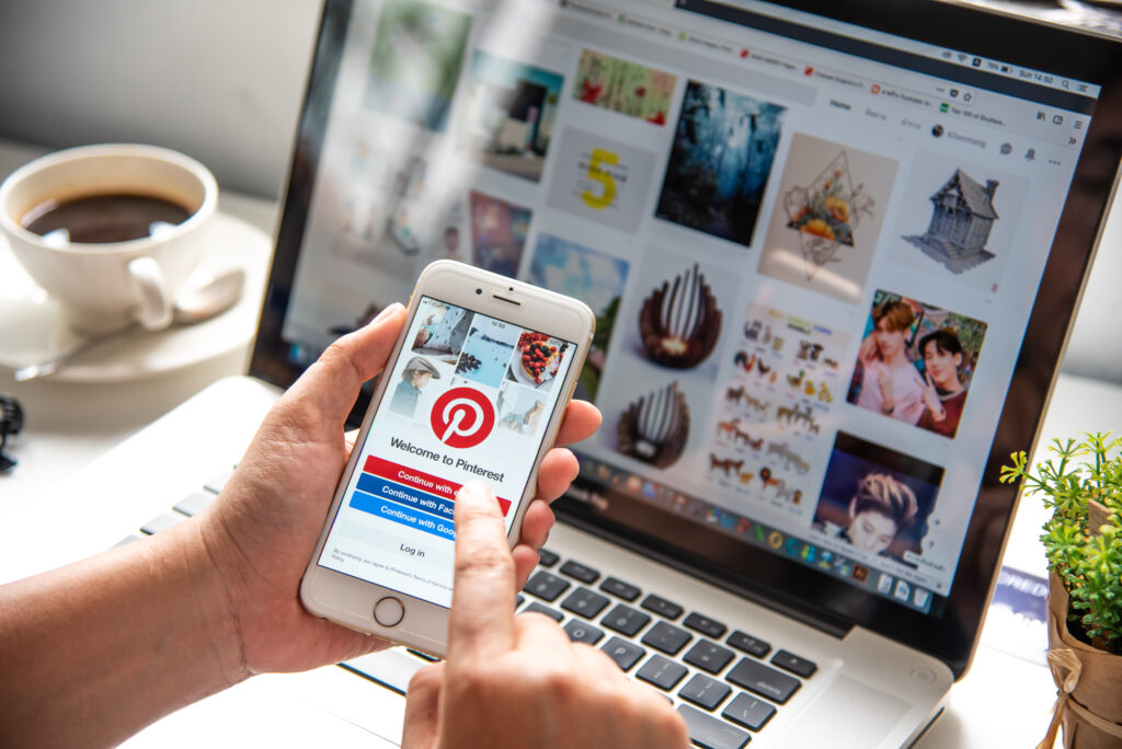
Once you know the purpose of your t-shirt, we recommend looking for design inspiration. Look around for similar designs or similar companies’ t-shirts, especially your competitors’. What stands out to you? What do you like or dislike about their design? What would you want to change?
Consider starting an inspiration board. Search online for design ideas and print them out to paste to a vision board. Online tools like Pinterest or Instagram’s “collections” feature are great for creating inspiration boards digitally. Once you figure out what you like, you can dive into the specific details of your design, like size, placement, fonts, and more.
Size
When determining the size of your design, the design itself, and the garment it will be printed on play equally important roles. Does your design lend itself to a large print? Or would it look better being smaller and having more space around the edges?
Depending on the print method, there may be a limit to how big your design can be printed. For instance, many print shops will not print over the seams or all the way to the edge of a garment. It’s a good idea to reach out to your t-shirt printing company to determine their print capabilities before finalizing your design.
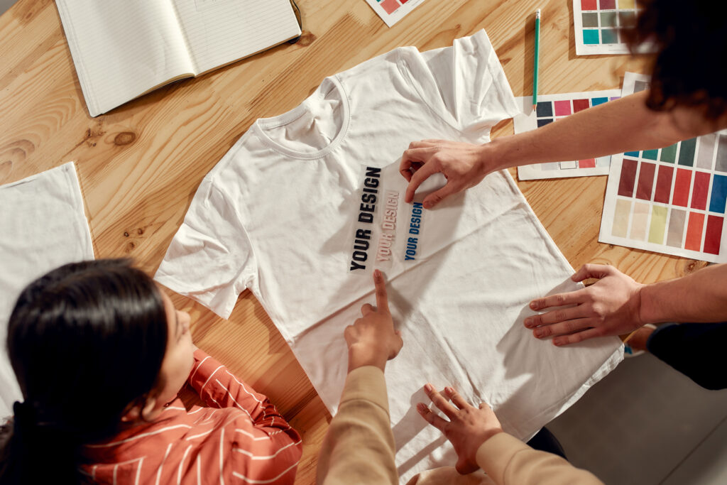
One tried and true method that we always recommend is printing out your design on paper then holding (or pinning) it to a t-shirt. Compare different print sizes and ask yourself: How does each “feel”? Which size do you like more? Sometimes, going with your gut is the best deciding factor! Note that prints tend to look bigger when a t-shirt is worn than when it is laid flat.
You can also do this digitally, but seeing your design in the physical world really does make a difference. As a Philly printing company, we always provide digital mock-ups for our clients to approve before moving forward with their order. If you’re feeling totally lost, don’t worry! We offer custom design & consulting services.
Placement
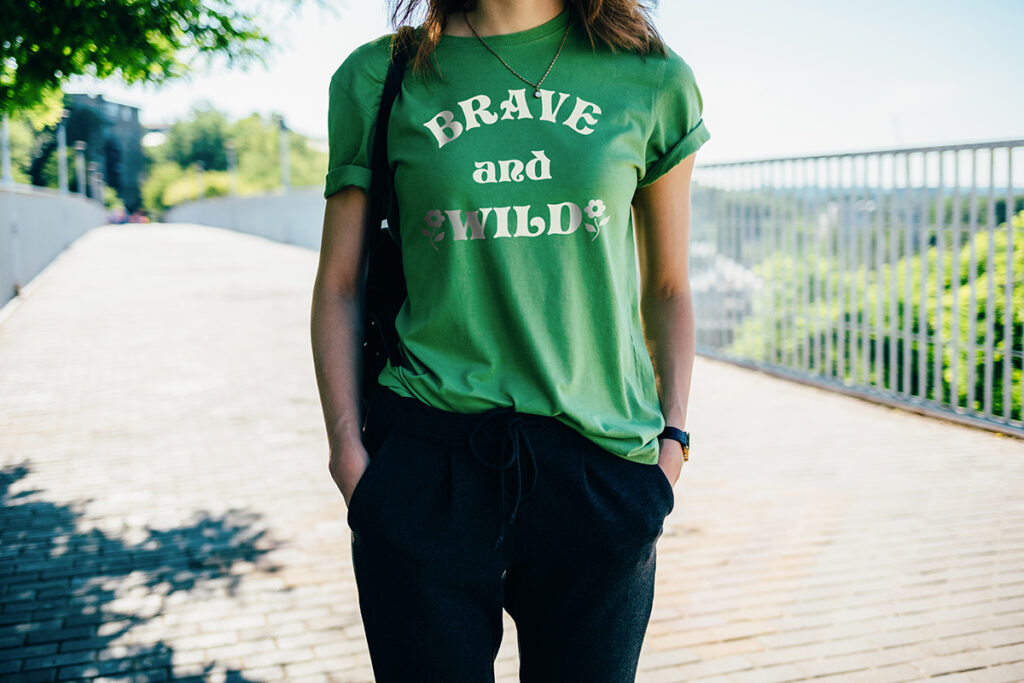
Print placement dictates where artwork is printed on a shirt. Most designs look great when centered and not too low on the chest. Some simple designs, especially text-based logos, are well-suited for a left-chest print: a small print placed on the wearer’s left side, where a pocket would be (or is, if you’re ordering pocket tees!).
Just as you did when determining the size of your design, printing out and physically pinning your artwork onto a shirt is a great way to figure out what you prefer. Or, you can request a digital mockup from your choice of t-shirt printing companies in Philadelphia.
Fonts & Typography
Typography is the art of styling and arranging text. If your design involves text, you will want to select the font you use carefully. Reflect on the purpose of your design, and determine what “mood” your font should have. Fun and bold? Sophisticated and sleek? There are hundreds of thousands of fonts to choose from; our skilled design team is ready to recommend the perfect option for your project.
The size of your print matters when selecting fonts as well. You want to be sure that text is easy-to-read at the size it will be printed. We’ve said it again and again, but printing out your design and seeing how it looks (and how well it reads) in real life is crucial here.
Color Choice & Contrast
Color choice can be an important element when designing your t-shirt. Some might choose to take a risk by choosing unconventional color combos, but for those looking to play it safe, here are some tried and true color combinations that work well for any design:
- Any medium to dark color and white
- Green and grey
- Blue and yellow
- Blue and grey
- Dark blue and light blue
- Red, white and blue
- Red, orange, and yellow
Contrast is the measurable degree of difference between colors. Let’s say you use a heather grey shirt as your base and then print a two-tone grey design on it. If you do not allow for enough contrast between the grey colors, the design might get lost. Having strong contrast in your design will make it pop!
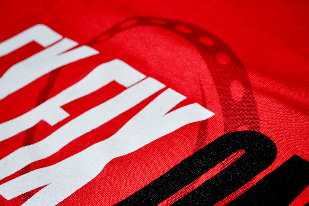
Use of Solids & Halftones
You can add depth to your design (without adding extra print colors) by incorporating halftones in addition to the solid portions of your design. A solid print is just like it sounds, a solid fill with no variation in color or opacity. On the other hand, halftones can be used to create color gradients and varying levels of opacity/transparency through the use of dots.
Newsprint is a great example of how halftones are used. If you were to look closely at a photo printed in the newspaper, you would notice that it was made up of a variety of little dots. When viewed from a normal distance, those dots create the appearance of an image with a wide variety of shades and tones.
Time to Print
Now, it’s time to bring your design to life! As one of the best T-shirt screen printing companies in Philadelphia, Press & Release Printing can help with everything from design to mock-ups to printing. Contact Us today to learn more about our Philly printing company.