
When you set out to print a unique design for your company or business, knowing the difference between spot color and process printing can save you time, money, and improve quality. Discover the difference between both printing methods so you know how to best represent your brand and graphics.
As a business owner or designer for a business, one of your most important jobs will be ensuring that your branding is represented in such a way that communicates quality and integrity. No matter the medium, the colors and printing processes you choose will make the difference between your design catching someone’s eye, or going unnoticed. It’s important people love your design and wear it regularly; amateur attempts will surely be forgotten in the depths of dressers, closets, and junk drawers.
To create the perfect custom merchandise, it’s vital to understand the differences between various printing processes and which method fits your design best. The two most common methods are spot color and process printing. Understanding the difference can help you save time, get the most out of your budget, and boost your brand visibility.
Spot Color
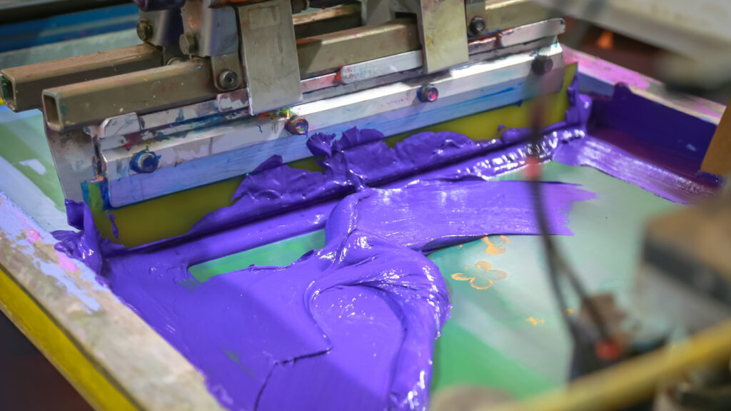
The most common printing method in the industry (and the default option at most print shops) is spot color printing. This is the process of laying down a pre-mixed color with the goal of translating that exact color onto the garment. This method is most often used with vectored elements such as text, shapes, icons, or logos.
Typically, spot color printing is a great option when you need to ensure that your design and the colors used in it are consistent across many imprints. Spot color printing can help you create rich, distinct colors, ideal for when getting the color just right is important. If your artwork or company logo uses specific Pantone colors, spot color printing is definitely the way to go.
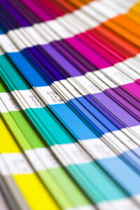

To recap: spot colors are ideal when color accuracy and consistency across print jobs are crucial. Because each spot color requires its own screen, limiting the number of colors in your design will minimize the number of screens used and reduce your overall set-up fees. Company logos and brand elements that feature a few specific colors are perfect examples of when you would want to use spot color printing.
Using Halftones
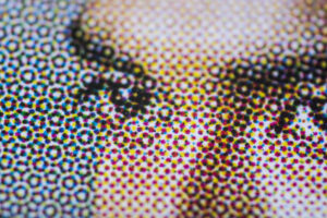

Newsprint is a great example of how halftones are used. If you were to look closely at a photo printed in the newspaper, you would notice that it was made up of a variety of little dots. When viewed from a normal distance, those dots create the appearance of an image with a wide variety of shades and tones.
You can use halftones with spot color (to create the appearance of gradients and different opacity levels), but they are the main foundation of process printing.
Process Printing
While spot color printing is a fantastic option for producing accurate and rich colors, there are many cases where your design may be more suitable for process printing. Process printing is a print method in which the appearance of a specific color is reproduced with overlapping halftones. For example: in spot color printing, you would print the color green with green ink, plain and simple. However, with process printing, you might achieve the appearance of green with a combination of blue and yellow halftones. If green was one out of, let’s say, fifty colors in your design, you would opt for process printing so that you could achieve the look of fifty colors without needing to create (and pay for) fifty separate screens.
So how do you determine what colors your halftones should be in order to properly reproduce your artwork? And how do you turn your artwork into these halftones? Process printing requires an artist skilled in print graphics to properly separate your artwork into halftones, but not to worry! Many print shops have artists on staff to do exactly that, and there will usually be an artist’s fee associated with this service, depending on which kind of process printing you need. In the screen printing industry, there are two main methods: CMYK and simulated process.
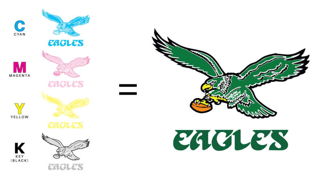
CMYK
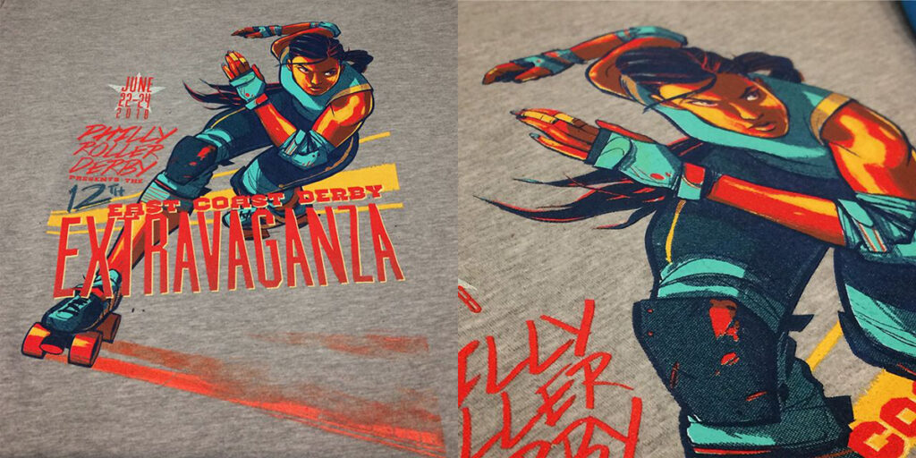
If you’re familiar with print graphics, or if you’ve ever changed the ink in an inkjet printer, you’ve most likely heard of CMYK. This is a kind of process printing that combines varying levels of cyan, magenta, yellow, and black (“key”) inks to produce a broad spectrum of colors. For example, combining magenta and cyan will result in a violet print. In this case, you would need two screens, one for cyan and one for magenta. A more complex example: the classic kelly green worn by the Philadelphia Eagles up until 1996 can be printed by layering halftones of 100% cyan, 20% magenta, 90% yellow, and 30% black. Go birds!
CMYK printing is meant to be done without flashing (a technique in which each layer of ink is dried before printing the next layer), allowing the inks to mix with each other directly on the shirt and create a smooth “blend” between colors. Because of its ability to accurately print incredibly specific images with varying hues and shades (think photos or gradients), CMYK is a great choice for designs that are more complex than text, icons, and shapes with solid fills.
However, CMYK printing has two main drawbacks: it’s not great for producing super vibrant colors and therefore, it’s not the best option for highly accurate color representations. Have a complex design that includes a few colors you want to make sure are accurate? Simulated process is the compromise for you.

Simulated Process Printing
Simulated process printing (sometimes known as “spot-process”) utilizes the same general principles of CMYK printing, but often requires additional colors outside of cyan, magenta, yellow and black. This is great for when you have a full-color image, but also want to include specific PMS colors. With simulated process printing, printers have more flexibility to reproduce images that may not be possible with spot or CMYK printing.
Whereas CMYK uses four screens, the simulated process will usually require upwards of six. For this reason, the simulated process is best reserved for bulk orders, to help balance the cost of multiple screen set-ups. Have a smaller order? You might want to check out direct-to-garment printing instead.
If your design contains many different colors and can’t be boiled down to spot or CMYK printing, a simulated process print just might do the trick.
Discover Your Screen Printing Options At Philadelphia’s Press & Release Printing
Whether you are looking to print a single spot color, recreate a photo through CMYK printing, or push the limits of full-color screen printing, you should work with a team with the experience to guide your decisions. Press & Release has the knowledge and know-how to exceed expectations in your print needs. With years of experience with many of Philadelphia’s top companies and organizations, Press & Release’s team of qualified printers has the expertise to help you bring your brand to life.
Contact the team at Press & Release Printing to learn more about our full suite of services. As one of the best printing companies in the Philadelphia area, we are happy to help you create stunning designs and graphics that impress and inspire your team, customers, and more.